

An e-commerce website is beautifully designed and animated with the help of creative designers. But these websites are pinning low conversion rate with lower profits compared to their potential audience. The difference can be easily spotted when you view your e-commerce portal from customer’s point of view. Let's discover the essential inputs for e-commerce websites.
Essential Inputs for E-commerce Websites:
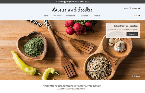
Ideal e-commerce webpage: Apple.comSimplify your design focus on Product
 You product should be the highlight of your website. While designing is important, product layout and centralization attract customer’s attention. You have relevant web traffic with the help of marketing therefore, when visitors enter your e-commerce portal they know what they want. You have to present in a CLEAR format with bold labels. For Example: e-commerce website myownbike clearly highlights its product and service on its homepage.
2. Design according to your TARGET AUDIENCE
 There are a lot of exquisitely designed websites showing a luxurious view while targeting audience in lower product segments. On the other hand, while targeting high-end of the market with expensive products, their e-commerce portal is understating its view with inefficient designing. For Example: Here is a view of Leoneck Hotel in Zurich which fails to get reservations online because of its e-commerce view. Expect to live here in ZURICH???????? No way!
3. High Quality Pictures
Quality pictures gain attention of visitors and fund up conversion rate. Most of the top websites like apple, reebok, ebay, amazon, and others provide high quality view of their products. You can use pinterest to influence your audience through high quality pictures. To learn about pinterest strategies, check out our infographic on pinterest.4. Internal Pages: Landing page, shopping cart, etc.
It is a common mistake to feature our home page as the cherry on top and miss out on the cake. Your home page is a welcoming page, but the treat comes from your internal product pages, landing pages and shopping cart view. Needless to say, you have to give more attention and time to design your featured pages as they attract sales while homepage creates first impression of your website.5. Contact Us! Where is it?
Customer reviews, enquires, complaints, appreciation, etc. all are important for success of an e-commerce business. Interactivity and two-way communication is essential for growth of your business, you already know that. But, how will it happen if they can’t find you? Yes, the biggest disaster is when e-commerce websites create a tiny contact us button which is untraceable until the end of screen. In fact, some even miss out on placing one. Learn from these blunders and add a clear clickable Contact Us button in the title bar of your home page.6. Clickable- Use a gradient below a button
While designing a page, going for simplicity doesn’t mean forget the essentials. Make your buttons clearly visible with a click ability function. Add a color, gradient or design to highlight specific buttons like BUY. Keep appropriate size and clear visibility presenting a clicking function to your buttons, this will ease browsing for your visitors.7. Logo and Identification Symbols create a image and credibility
Identification of your brand and visible creation of a unique logo, symbol and design is a necessity. Don’t forget to label all your pages with an identification mark. It provides security to your visitor and creates your Brand’s Image.
Contact Shopify Expert if you need further assistance.