


In today’s market, almost every business, as well as individuals working have their website. But sadly, a large number of these sites are poorly designed or come straight from a WordPress template; this is not going to help you get ahead or stand out.
Good website design is a must in today’s highly visual market. The way your site looks tells users whether they want to interact or do business with you in just a fraction of a second. One glance can or force someone to click away, or turn that person into a customer.
As a bonus, this post is filled with website design inspiration that helps you make your site look good and professional. Here are some of the ways:-
1) First Impressions Matter: Importance of Great Visual Design
When it comes to your website design, first impressions count. It takes just 50 milliseconds (that is 0.05 seconds) for users to form an opinion about your website that determines whether they like your site or not, whether they will stay or leave.
This number comes from some specific studies. In the first study, participants twice rated the visual appeal of web homepages presented for 500 ms each. In a follow-up study, they reduced the exposure time to 50 ms. Throughout, visual appeal ratings were highly correlated with one phase to the next as were the correlations between the 50 ms and 500 ms conditions. As a result, visual appeal can be evaluated within 50 ms, signifying that web designers have about 50 ms to make a good first impression

See the statistics here:
- First impressions are 94% design-related. Means it is the prime reason for mistrusting or rejecting a site.
- 75% users make judgments on a company’s credibility based on its website design.
- 88% of users are not likely to return when they have had a bad user experience.
So, it is crucial to make the first impression of your website appealing. It depends on many factors: structure, spacing, colors, symmetry, fonts, amount of text, and more. Focus on these elements to get an interface that attracts customers towards your website. Below are some more tips that help you make good website design:
(A) Visual Appeal More Significant Than Usability for User Insight
A study examined the effects of usability and visual appeal on user performance and satisfaction with a website.
Users completed different tasks on websites which varied in usability (low and high) and visual appeal (high and low). Results show that first impressions are most inclined by the visual appeal of the site. Users gave high interest and usability ratings to sites with high appeal and low usability and interest ratings to sites with a simple appeal. User insights of a simple appeal website were not considerably influenced by the site’s usability even after a successful experience with the website.
Key Benefit: Pay for design – it is what matters the most for pulling users in. Funny enough, a great visual design will lead to higher usability ratings even. And actual usability will matter much less if the overall visual appeal is low.
(B) Eye tracking study identifies key elements
It takes 2.6 seconds for a user’s eyes to land on that area of a website that most influences their first impression.
The researchers monitored students’ eye movements as they scanned the web pages. The researchers then analyzed the eye-tracking data to determine how long it took for the students to focus on specific sections of a page – such as the menu, logo, images and social media icons – before they moved on to another part. They discovered that the better the first impression, the longer the participants stayed on the page.
The website sections that drew the most interest from viewers were as follows:

- The institution’s logo. Users spent about 6.48 seconds focused on this area before moving on.
- The main navigation menu. Almost as famous as the logo, subjects spent an average of 6.44 seconds viewing the menu.
- The search box, where users focused for just over 6 seconds.
- The site’s main image, where users’ eyes fixated for an average of 5.94 seconds.
- The site’s written content, where users spent about 5.59 seconds.
- The bottom of a website, where users spent about 5.25 seconds.
Key Benefit: Good first impression leads to longer visit duration. Make sure the 6 elements listed here look great.
(C) First impressions are 94% design related
British researchers analyzed how different design and information content factors influence trust of online health sites.
The study showed clearly that the look and feel of the website are the primary drivers of first impressions.

Of all the feedback the test participants gave, 94% was about design (complex, busy layout, lack of navigation aids, nursing web design especially make use of color, pop up adverts, slow introductions to a site, small print, too much text, corporate look and feel, poor search facilities). Only 6% of the feedback was about the actual content. Visual appeal and website navigation appeared had by far the biggest influence on people’s first impressions of the site.
At the same time, poor interface design was particularly associated with rapid rejection and mistrust of a website. When participants did not like some aspect of the design, the whole website was often not explored further than the homepage and was not considered suitable.
Similar results were found in a study research for Consumer Web Watch, conducted by Stanford University credibility experts. They found that what people *say* about how they evaluate trust of a website and how they *really* do it are different.
The data showed that the average consumer paid far more attention to the superficial aspects of a site, such as visual cues than to its content. For example, nearly half of all consumers (or 46.1%) in the study assessed the credibility of sites based in part on the appeal of the overall visual design of a site, including layout, typography, font size and color schemes.
Key Benefit: Great design gets people to trust you and to stick around. Poor design creates mistrust and makes people leave.
(D) Inspiration drives better first impression
A study looking into the role of first impressions in tourism websites found that inspiration-related elements had the greatest impact on the first impression formation. This suggests that visually appealing stimuli is a very important tool for getting people to stay longer on the site and thus converting more visitors into buyers.
Usability was the second most significant driver of first impression formation, followed by credibility.
All in all, this tells us that travelers want to get inspired about a destination (inspiring imagery), they don’t want to waste mental energy on figuring stuff out (usability – don’t make me think) and they want to be sure this travel provider is legit (credibility).
Key Benefit: If you are selling a dream (e.g. the idea of going on a holiday to Fiji), inspiring photography is the leading first impression creator.
(E) Positive first impressions lead to higher satisfaction
In an experiment conducted to study the effects of product expectations on subjective usability ratings, participants read a positive or a negative product review for a novel mobile device before a usability test, while the control group read nothing.
The study revealed a surprisingly strong effect of positive expectations on subjective post-experiment ratings: the participants who had read the positive review gave the device significantly better post-experiment ratings than did the negative prime and nonprime groups. This boosting effect of the positive prime held even in the hard task condition where the users failed in most of the tasks.
Key Benefit: if they “instantly” like your site, they are ready to cut you some slack for any hiccups down the line. It only makes sense to assume that this kind of priming also works the other way – negative first impression decreases the overall satisfaction with your site.
2) Play by the Rules
As a very basic starting point, you need to make sure that you follow web standards. Content nicely aligned, padding even, images high quality…even a ‘boring’ website can be helpful to use if it follows the rules and, therefore, looks tidy. Look into what web designers are saying about content distribution, site sizes and font types. It is all out there for you.
Here are a few very important design considerations to bear in mind:
(A) Navigation
How clear and simple your menu is can make or break. Your pages need to follow an instinctive, user-targeted route, or you will lose visitors as soon as they feel in the slightest bit disorientated.

Think about what your average user expects. They need a homepage because that is how they will stop themselves getting lost. They need a contact page at the end because it is the last logical step. They need a marker, so they know where they are. And they need everything named and filed in a sensible fashion.
‘Services’ is not a good page name. For a start, it’s hardly showing search engines that it’s a relevant page. What services? Bicycle repairs, circus, acts, underwear design?
More importantly, your visitor is going to make a snap decision to stay or go based on a two-second glance at the page they have landed on. The navigation bar is your visitor’s menu of what you do: give them what they came here for!
(B) Content Importance
Good content is what sets your website apart from the masses and delivers the right message into the hearts and minds of your customers. The success of your website is determined primarily by its content. Ultimately, content wins the wallets of your customers. All other components of your website (design, visuals, videos, etc.) provide a secondary support role. If you have effective taglines, great design will only enhance their effectiveness. The design itself does not sell.
The content of your website should always begin with proper market research. First, you should determine your high-value customers (HVC) and define personas for your website. Then you should determine how you will target them. Taglines and slogans that are customer-centric (i.e., focuses on the needs and wants of the customer) are essential to capturing the attention of your prospective customers. Your taglines must deliver a clear value proposition and include an effective call to action.
The key to a successful website is having clear, relevant and keyword-rich content that delivers the right message with power and conviction. The content on your website should target your audience, engage them and persuade them to take action.
(C) Fonts
Google has a complete list of web-suitable fonts for a reason: some fonts just don’t work for the web! Even those on the approved list need to be of an appropriate size and color for easy reading. Some quick tips for these are given below:
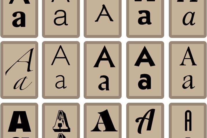
- White on black is very disgusting to read
- Flashing text is an interruption at best, an instantaneous bounce at worst
- Line height makes a huge difference to how clear your fonts are
- Serif fonts make people think ‘traditional.'
- Sans serif fonts make users think ‘modern.'
Mistakes with fonts can cause your user to skip completely your carefully crafted website, as a consequence missing a large chunk of your sales pitch. Make it simple, make it pleasant.
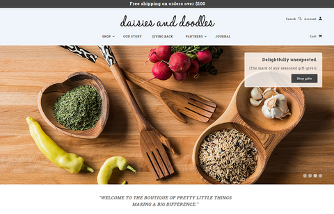
(D) Images
People are visual. They like to look at images. So just chuck a lot of images on the website, right? No, no, no, don’t ever do this. Poor use of images can be poorer than no images at all, so try to remember these points:
- If your image is very big, it will slow down the loading time of your website. If it is very small, it will be pixelated. Neither are good, and both make web users unsatisfied & annoyed.
- Everyone can spot stock images. There are only so many times that guy in the suit holding the phone can appear on the Internet before it shatters, people. Try to com across a nice, affordable local photographer to do a quick shoot with your premises, but please do not make him take 200 shots of your shot blasting equipment – no one cares. Humans want to look at other humans, preferably smiley ones. If your visitor knows that when they pick up the phone, they are going to get Mick – who looks like a total laugh but very capable with it – they are going to call.
- Why not give some illustrations a go? Info-graphics are so popular right now and give way more details than just a photo. By displaying key information in an attractive and even humorous way, you are increasing your chances of a visitor absorbing the things that will make them buy.
- Make use of the Rule of Thirds. Even the biggest idiot in the world can tell that you get a much more visually pleasing result by cropping an image, so the subject is in the outside 1/3 or 2/3. This can also be utilized to change the balance of a website. Where do you want the visitor’s eye to go?
- A full-width, large main image nearly always looks good. Remember that.
So, that is you started. Everything you can perhaps need to know about websites is out there to be found on someone’s website. But more than that, YOU know what makes a good website. You do – you feel it every day as you are browsing. What makes you buy, what annoys you? Go with it.
3) Make your Website Load Faster
Page loading time is noticeably an important part of any website’s user experience. And many times we will let it slide to put up better aesthetic design, new nifty functionality or to add more content to web pages. Awkwardly, website visitors have a tendency to care more about speed than all the bells and whistles we want to add to our sites. Over and above this, page loading time is becoming a more vital factor when it comes to search engine rankings.
See the statistics here:
- It takes 10 seconds to leave an impression on users to tell them, what you are about, and what you are selling.
- 64% Smartphone users expect websites to load in less than 4 seconds.
- 40% users leave a website if it takes more than 3 seconds to load.
- It takes 2 seconds of delay during transaction for 87% of consumers to abandon the page
- 18% of buyers abandon shopping carts because of slow pages.
- Lost sales from shopping cart abandonment attributed to slow pages: $3 billion.
After observing the statics, surely you will look for the ways to make your website load faster. There are hundreds of ways. In the sections below, we will focus on the effective best practices that yield the most benefit for the least amount of effort.
Step 1: Reduce the size of your page
Overstuffed content takes a long time to download. By reducing the size of your page, you not only boost up your speed, but you also cut the utilized network bandwidth for which your hosting provider charges you.
A simple optimization is empowering HTTP compression, which can often reduce the size of your text resources (HTML, CSS, and JavaScript) by fifty percent or more. WhatsMyIP.org has a great free tool to test if compression is turned on for your site. When using, don't just test the URL to your homepage, but also test links to your JavaScript and CSS files. Often we find compression is turned on for HTML files, but not for JavaScript and CSS. This can represent a considerable potential performance boost when your server is configured for compression properly. Keep in mind, though, you do NOT want your images to be compressed by the server as they are already compressed. The extra server processing time will only slow things down. You can learn more in this detailed guide on what content you should compress on your website.
If you discover your server is not making use of compression, talk to your hosting provider or server admin to turn it on. It is often a simple configuration setting, for example, see the mod_deflate module for Apache, IIS 7 configuration docs.
Moreover, images can often contribute to 80% or more of your total page download size, so it’s very significant to optimize them as well. Follow these best practices to cut down your image size by 50% or more in some cases:
- Don't utilize PNG images for photos. JPEG images compress photographs to meaningfully smaller sizes with great image quality. For example, on Windows 8 launch day, the Microsoft homepage used a 1 Megabyte PNG photograph when a visually comparable JPEG would have been 140k! Think of all the wasted bandwidth on that one image alone!
- Don't overuse PNGs for transparency. Transparency is a great effect (and not supported by JPEG), but if you don't need it, you don't always need the extra space of a PNG image, especially for photographic images. PNGs work better for logos and images with sharp contrast, like text.
- Correctly set your JPEG image quality. Using a quality setting of 50-75% can significantly reduce the size of your image without noticeable impact on image quality. Of course, each result should be individually evaluated. In most cases your image sizes should all be less than 100k, and preferably smaller.
- Strip out unnecessary metadata from your images. Image editors leave a lot of "junk" in your image files, including thumbnails, comments, unused palette entries and more. While these are useful to the designer, they do not need to be downloaded by your users. Instead, have your designer make a backup copy for their use, and then run the website image versions through a free optimizer like Yahoo's Smush.It or open source tools like png crush and jpeg than.
Last but not least, an additional good way to reduce your page size is to minify your Javascript and CSS. "Minification" is a process that strips out the extra spaces and comments in your code, as well as shortening the names of variables and functions. This is best seen by example:-

Your minified pages will still render the same, and this can often reduce file sizes by 10-20% or more. As you can see, this also has the added benefit of complicating your code to make it harder for your competitors to copy and modify all your hard earned work for their purposes. JSCompress is a basic, easy online tool for Javascript, or you can also try out more powerful tools like JSMin or Yahoo's YUI compressor (also works for CSS). There is also a useful online version of YUI, which we recommend.
Step 2: Reduce the number of browser requests
The more resources your browser requests to render your page, the longer it will take to load. A great strategy to reduce your page load time is to cut simply down the number of requests your page has to make. This means fewer images, fewer JavaScript files, a few analytics beacons, etc. There is a reason Google's homepage is so spartan, the clean interface has very few dependencies and, as a result, loads super-fast.
While "less is more" should be the goal, we understand this is not always possible, so are some added strategies you can employ:
- Enable browser caching. If your page dependencies do not change often, there is no reason the browser should download them again and again. Talk to your server admin to make sure caching is turned on for your images, JS, and CSS. A quick test is to plug the URL of one of your images into redbot.org and look for the header Expires or Cache-Control: max-age in the result. For example, this image of the eBay homepage will be cached by your browser for 28,180,559 seconds (just over one year).

- Combine related JS and CSS files. While numerous individual CSS and JS files are easier for your developers to maintain, a lesser number of files can load much faster by your browser. If your files change infrequently, then a one-time concatenation of files is an easy win. If they do change frequently, consider adding a step to your deploy process that automatically concatenates related groups of functionality before deployment, grouping by related functional area. There are pros and cons to each approach, but there is some great info in this Stack Overflow thread.
- Combine small images into CSS sprites. If your website has a lot of small images (icons, buttons, etc.), you can understand noteworthy performance gains by combining them all into a single image file called a "sprite." Sprites are more stimulating to implement, but can yield significant performance gains for visually rich sites.
Step 3: Reduce the distance to your site
If your website is hosted in Virginia, but your users are visiting from Australia, it will go to take them a long time to download your images, CSS, and JavaScript. This can be a big problem if your site is content-heavy and you get a lot of traffic from users far away. Fortunately, there is an easy answer: Sign up for a Content Delivery Network (CDN). There are a lot of excellent ones out there now, which include Akamai, Amazon CloudFront, CloudFlare and so more.
CDN's work basically like this: you change the URL of your images, JS, and CSS from something like this:
http://mysite.com/myimage.png
To something like this (as per the instructions were given to you by your CDN provider):
http://d34vewdf5sdfsdfs.cloudnfront.net/myimage.png
Which then instructs the browser to look out on the CDN network for your image. The CDN provider will then return that image to the browser if it has it, or it will pull it from your site and store for reuse later if it doesn't. The magic of CDNs is that they then copy that same image (or javascript or CSS file) to dozens, hundreds or even thousands of "edge nodes" around the world to route that browser request to the closest available location. So if you are in Melbourne and request an image hosted in Virginia, you may instead get a copy from Sydney. Just like magic.
To illustrate, consider the left image (centralized server) vs. the right image (duplicated content around the world):

4) Mobile Responsive
At present, the most effectual way to provide an integrated browsing experience for the mobile segment of your visitors is to take advantage of responsive web design. Even though it is a relatively new concept, it has already turned out to be the go-to choice for savvy marketers and designers who understand the significance of reaching their mobile audience.

What Are The Numbers Saying?
With each passing year, the number of mobile users surfing online is breaking records in leaps and bounds. With this situation, the current trend in the market is that they will be a mainstream online in just a couple of short years.
Not only that, but Google has come out with a guide for website owners, in which it states responsive design is its preferred configuration for mobile websites. And you want to be on Google’s good side since it can single-handedly determine your search rankings and, in turn, your organic traffic numbers.
In addition to this, a recent study by the Aberdeen Group found websites are achieving about 11 percent higher visitor-to-buyer conversion rate increases compared to non-responsive sites, which only receive a 2.7 percent improvement in performance year over year.
Some examples from companies, which include CareerBuilder, FreshSparks